Findings has only been out for 8 days, and I am really proud of the launch, impressed by the response and excited about all the work that’s ahead. But before marching into the future, I thought I should look back into the past. While the core functionality of the app has remained the same, it is quite amazing to see how much of the look and the design of the app has changed over the years… I am a big fan of ‘making of’ posts on apps. I wish there were more of these, so here is one for Findings!
Today
Findings is an application for scientists that help them keep track of their experiments and protocols. You can think of a protocol as a recipe, and an experiment as the actual instantiation of a series of recipes… or what normal people would call “dinner”. But scientists need to remember all they did in details, like timing, temperatures, volumes, etc… so they can write publications about what they did, and so they and others can reproduce what they did. If they do it right, knowledge progresses. If they don’t keep track of what they do, their work is for nothing. They need a lab notebook. It can be a paper notebook, or it can be Findings.
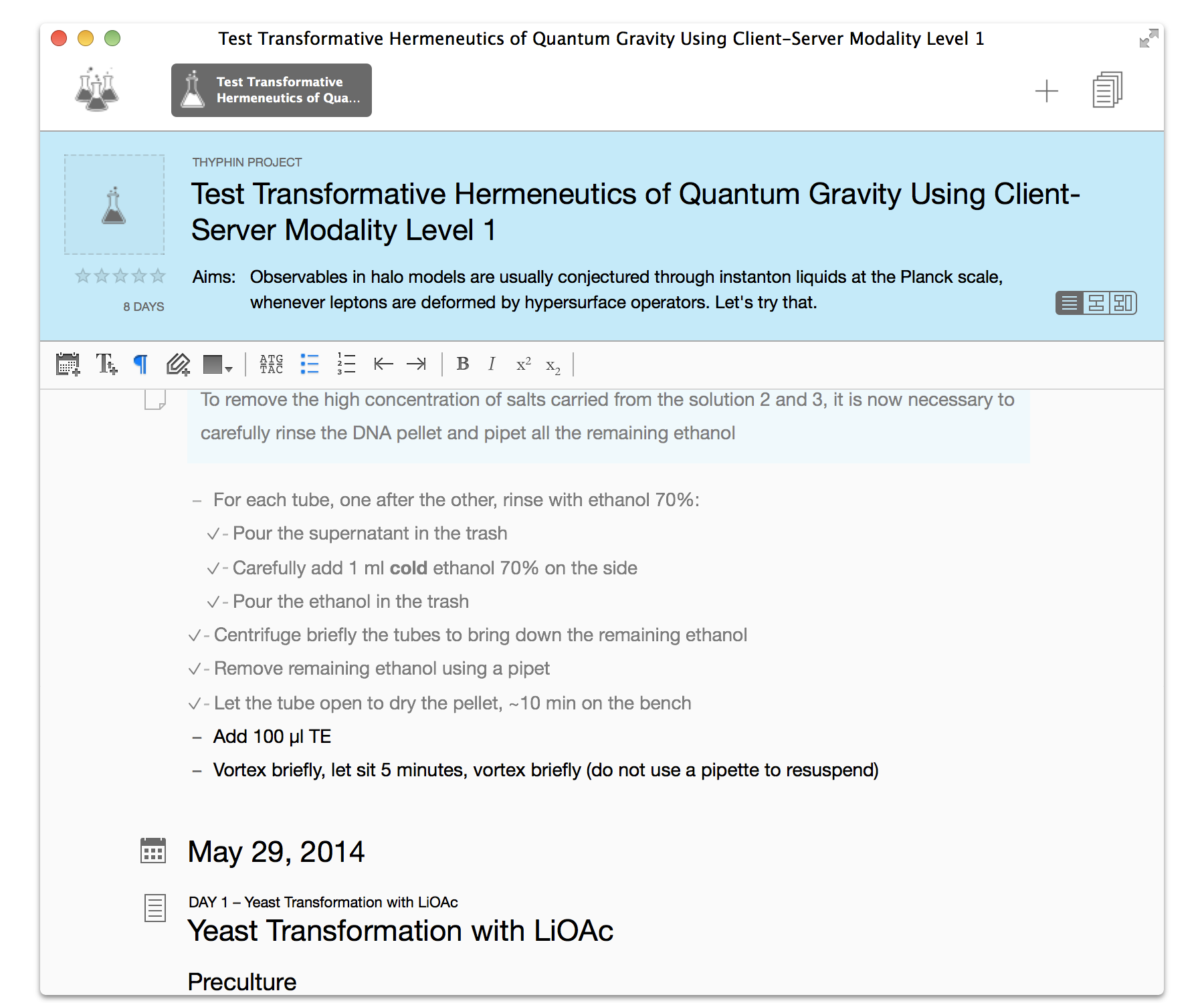
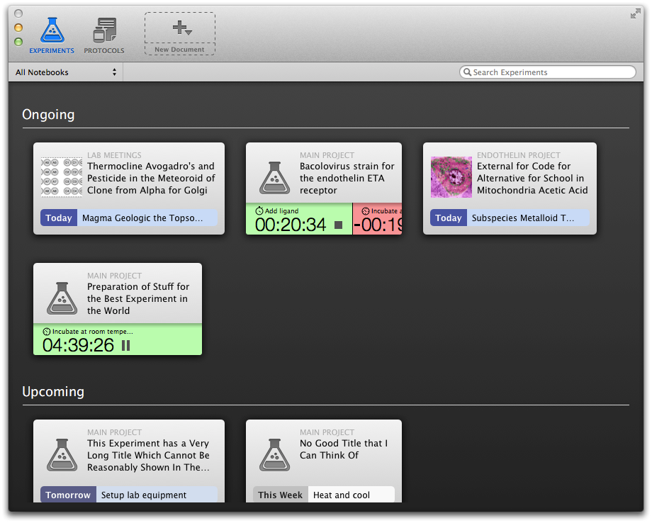
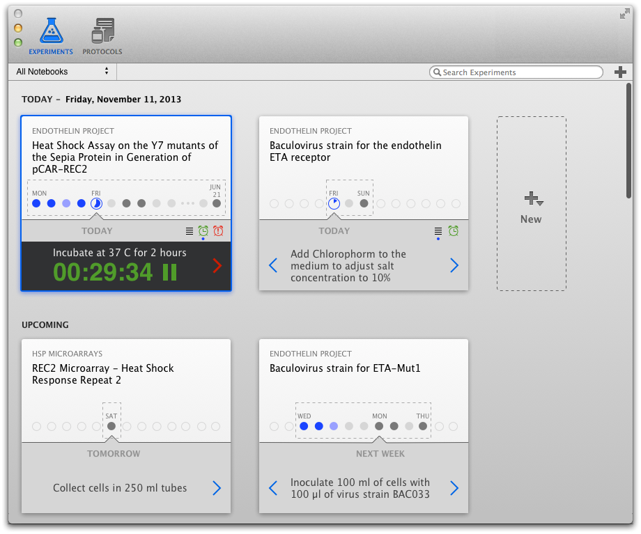
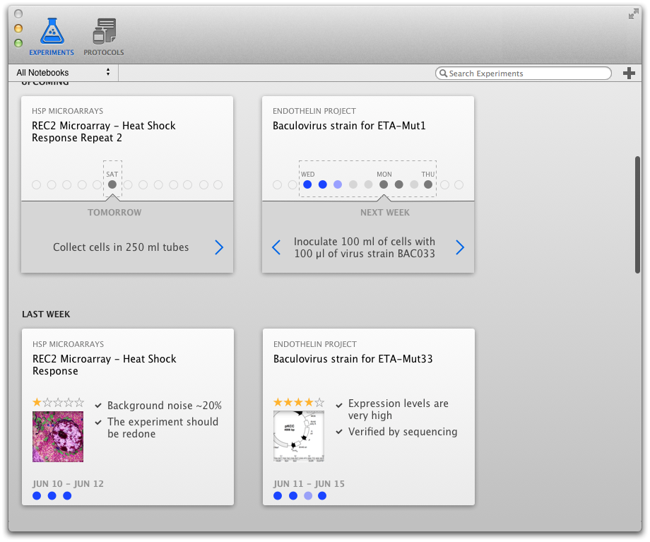
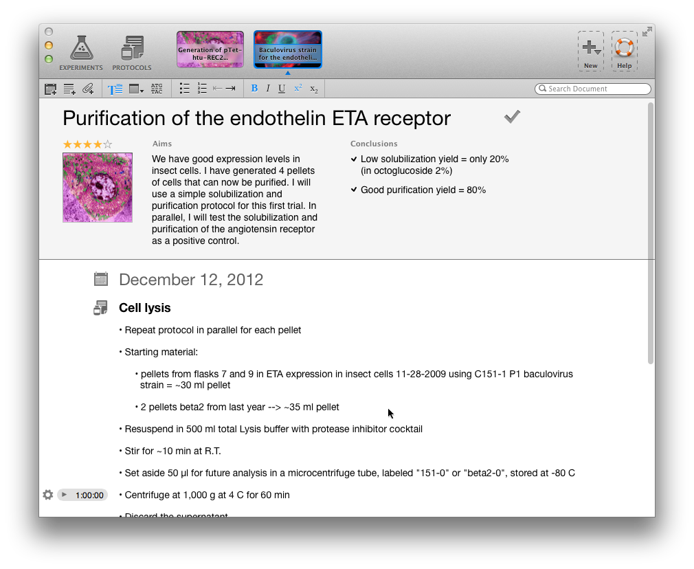
Now, let’s first have a look at Findings version 1.0 released last week (all the screenshots or mockups below can be zoomed in and out with one click). First, the experiment dashboard, where each experiment is represented by a card. Then, the content of an experiment you would see after double-clicking (“opening”) an experiment.
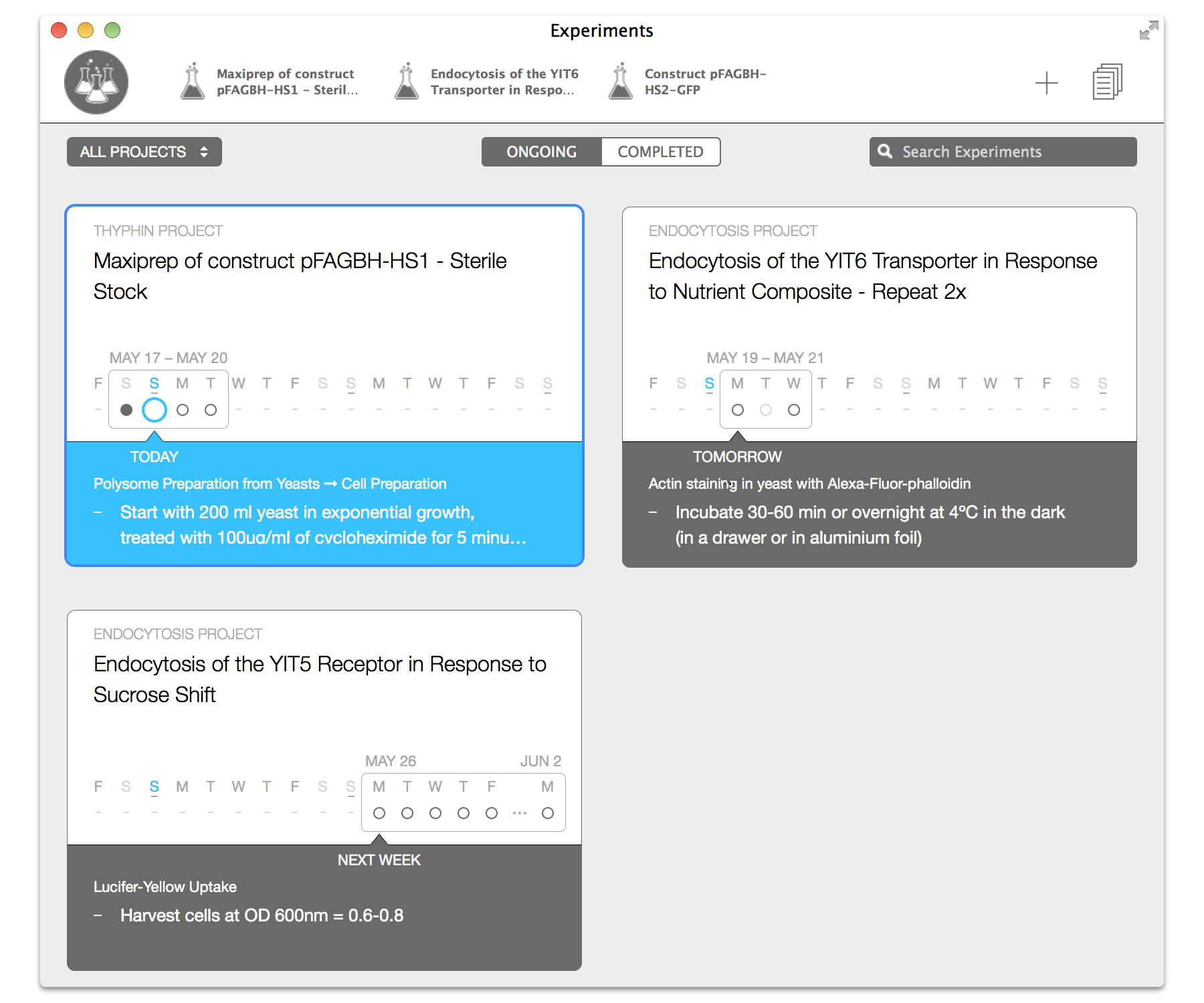
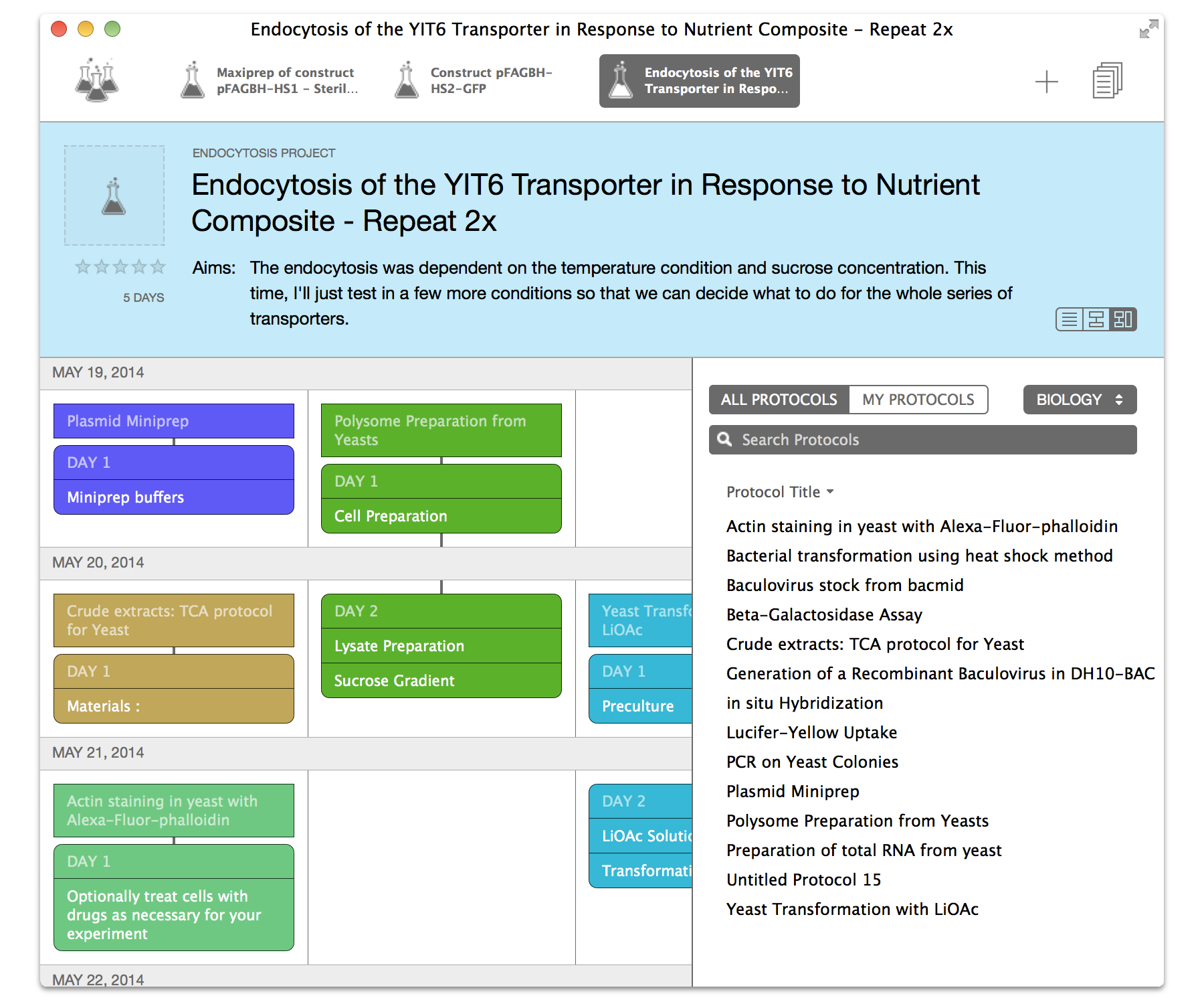
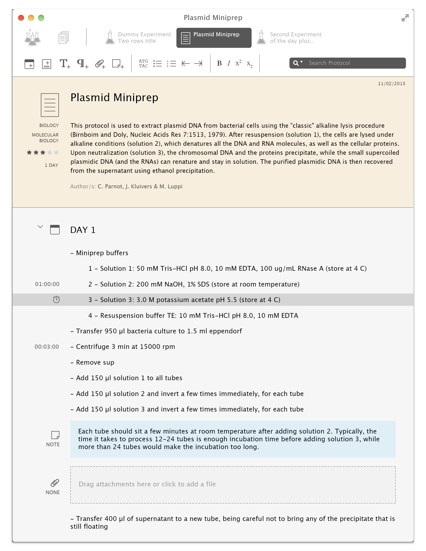
The title bar has all the navigation: on the left, the flask icon is used to get back to the dashbord. As you open experiments, individual tabs open for each (which you can reorder and close). There is also a special place for protocols, with a list / detail view, shown in the first screenshot. These protocols can be added in a calendar view to create an experiment, shown in the second screenshot (like you would drag an appetizer, entrée and dessert to create a meal):
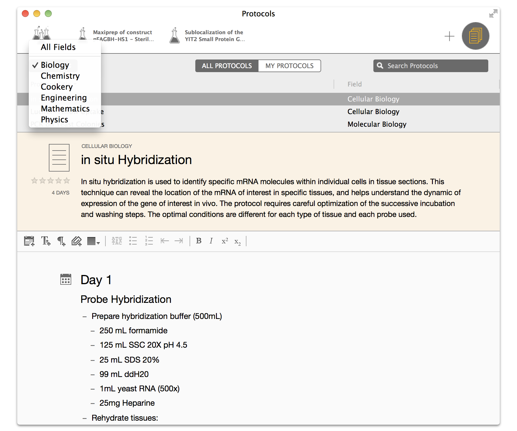
I am very pleased with the look of Findings 1.0, which has been crafted by the wonderful designer wrinklypea (Marcello Luppi, also an ex-scientist, as you may be able to tell from his handle). The result has been recognized as a visually pleasing “iOS 7-like OS X app”.
Just as imporant as the look, the user experience has been refined and improved a lot since we started (more about that below), and has just the elements needed.
5 Years Ago
Now it is time to poke your eyes with all kind of ugly sticks. That is also the fun part, and a great way to see all the progress made. Here are some very early designs. On the left, a mockup done in html for the main experiment library view. On the right, another mockup of the experiment content mocked up in Omnigraffle:
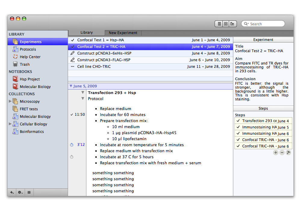
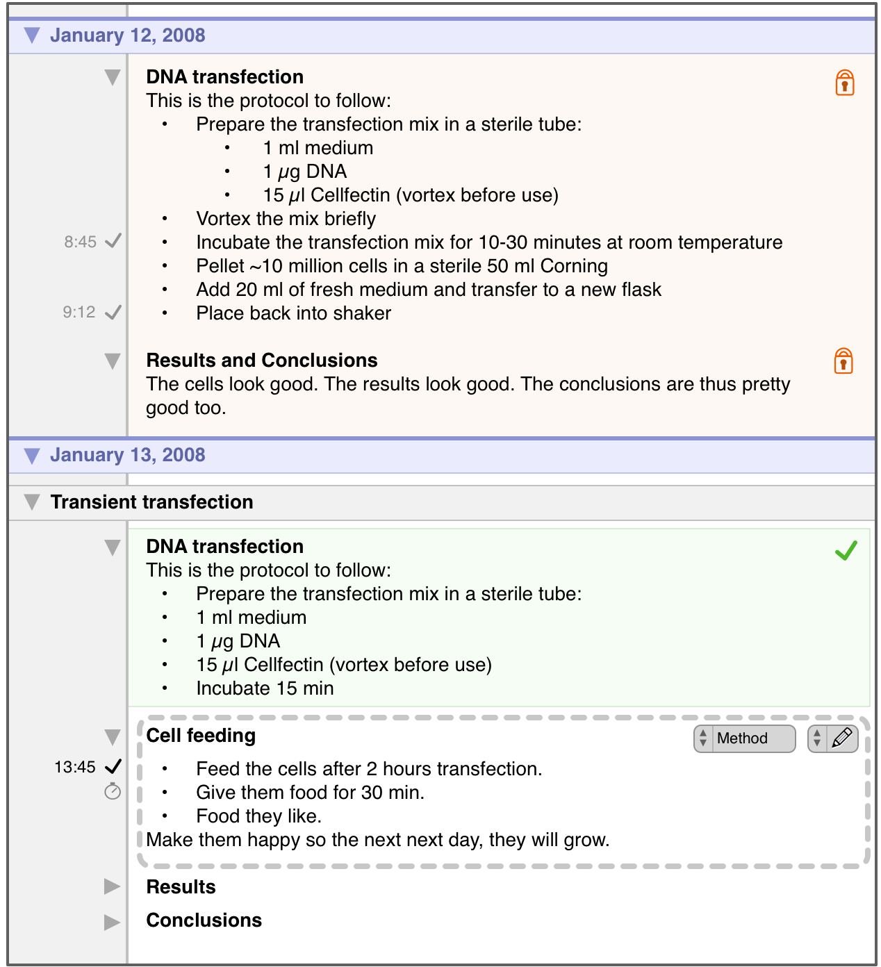
Yikes, that looks really old (and it is). The noticeable thing is that “Experiments” and “Protocols” are already there, as is the main logic of the app: you manage experiments, run them, organize them in “Notebooks” (called “Projects” in version 1). Experiments can be built from protocols. Experiments can be edited in a text editor. Some things are gone: collections, the inspector view, timers (these will come back!), locks in the text editor,…
The look was the classic source list from Mac OS X.
4 Years Ago
Coding started based on the above mockups, and Findings was becoming a real thing. This was interrupted by a switch to another project, Papers, the brain child of Alexander Griekspoor.
But not before Alex and I, tired of the painful-to-see look of the early Findings builds, tried to make it look more like Papers. After all, Papers was very successful, had won an Apple Design Award, and had a tried-and-true user interface and user experience.
Here are a few attempts at what Findings would look like with a list view or a collection view (mockups done in Photoshop):
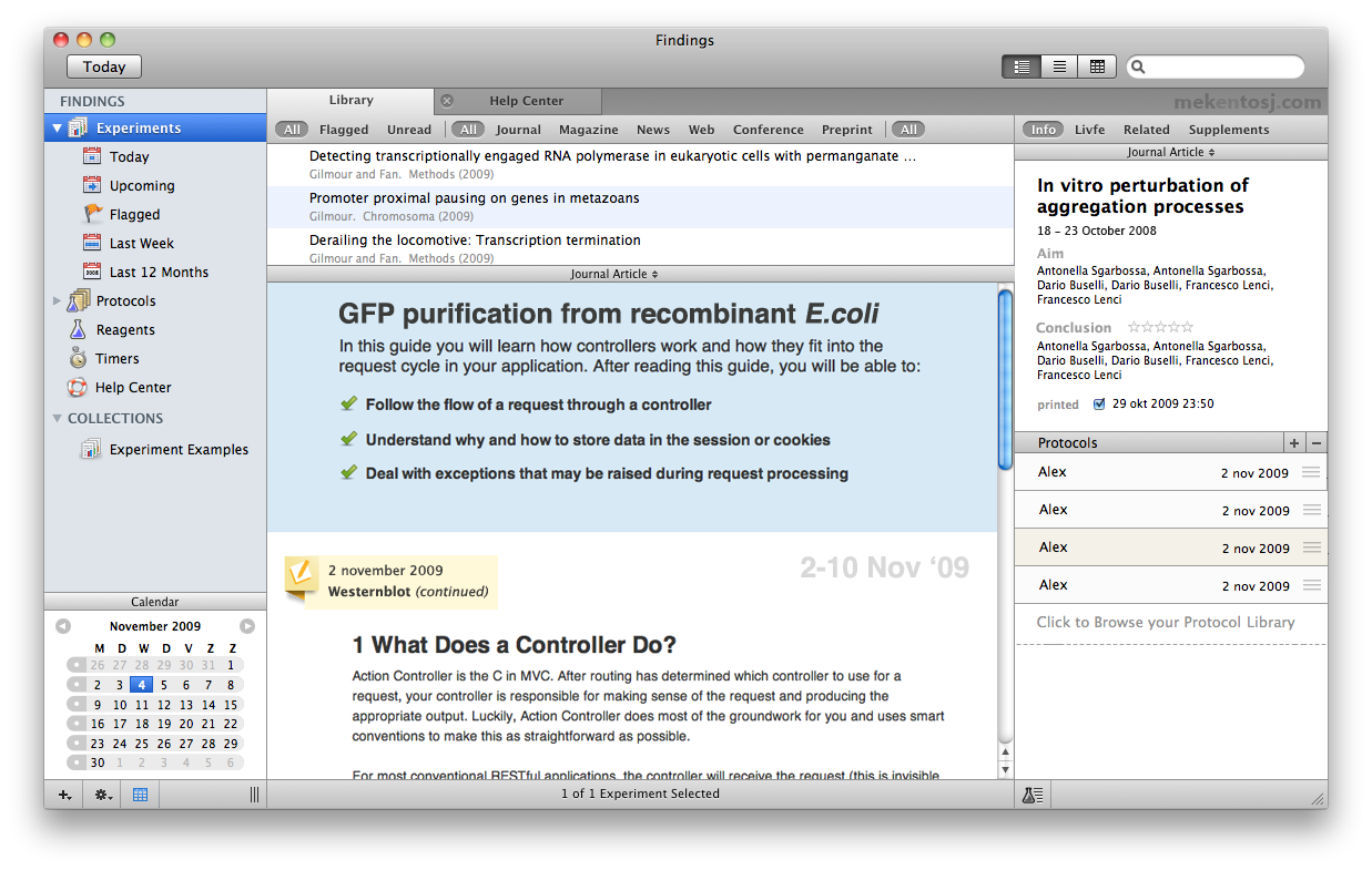
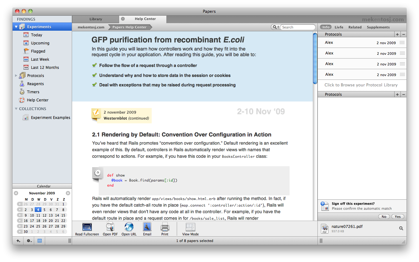
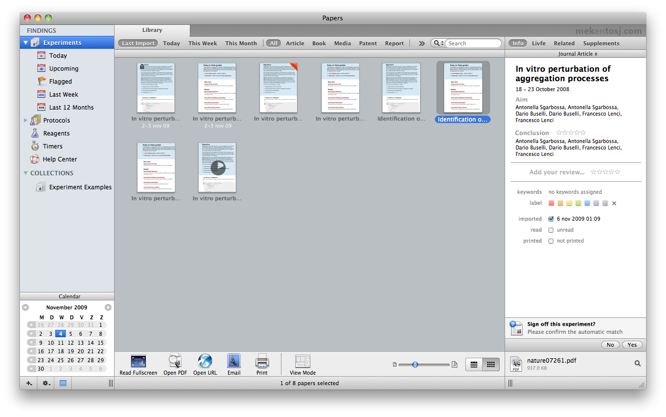
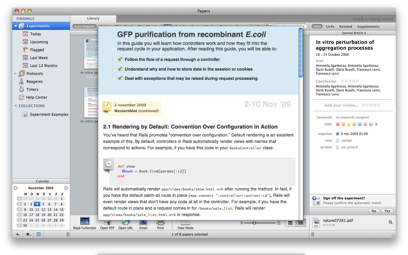
The source list was still there, although looking better than a year before. The collection view looked quite nice, actually. The text view of an experiment looked much better… but was totally ripped off the Ruby on Rails guides of the time (not sure how they look like nowadays). The mockups are Frankeinstein-like, but that “redesign” helped make Findings look more attractive.
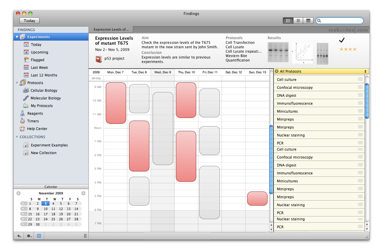
Around the same time, I also produced some mockups with some interesting ideas, and a more concrete calendar view (mockups done in Omnigraffle):
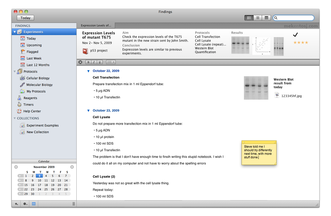
1 Year Ago
After a 3-year hiatus to work on Papers, Findings development was resumed. The workflow of the app was to remain the same as had been imagined 4 years before, but there was a clear need for a fresh start on the code base, and on the design.
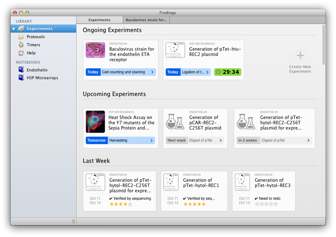
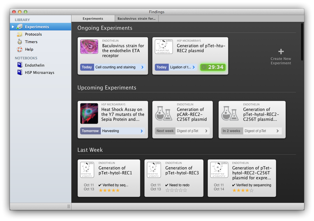
One of the first thing we did was to introduce the concept of experiment “cards”, displayed in a “dashboard”. It looks like a collection view, but the content of each card is not just a preview, but rather a summary of what is going on with this experiment. The overall dashboard gives you an overview of your week or of past weeks. We tried with white and black backgrounds (mockups done in Omnigraffle + Acorn):
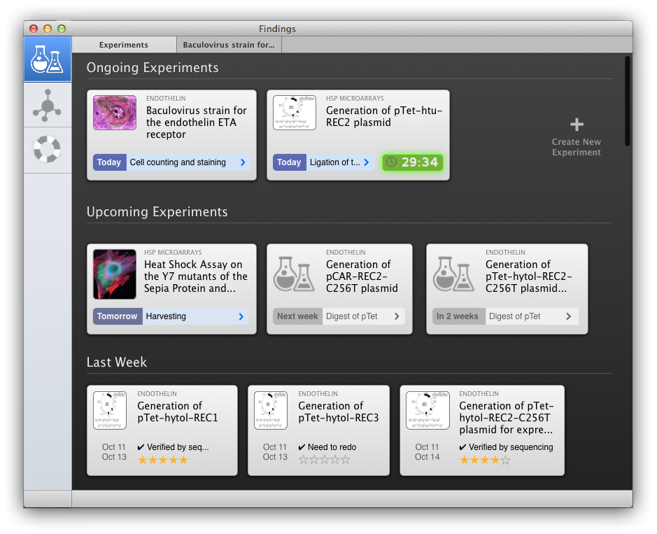
The next step was to finally get rid of the source list. For fun, here are a few of the initial mockups, generated over the course of a day, searching for inspiration from Coda (mockups done in Omnigraffle):
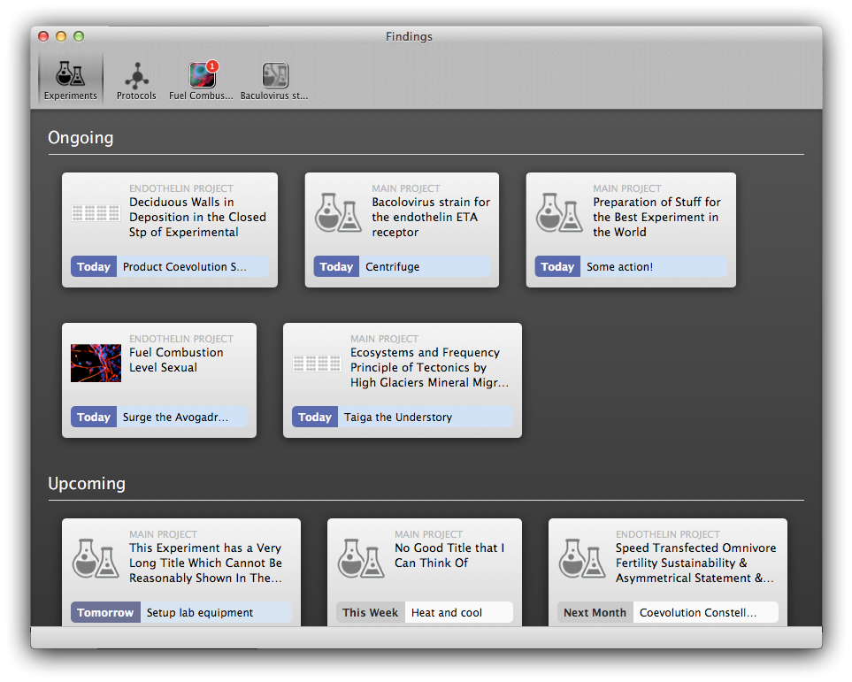
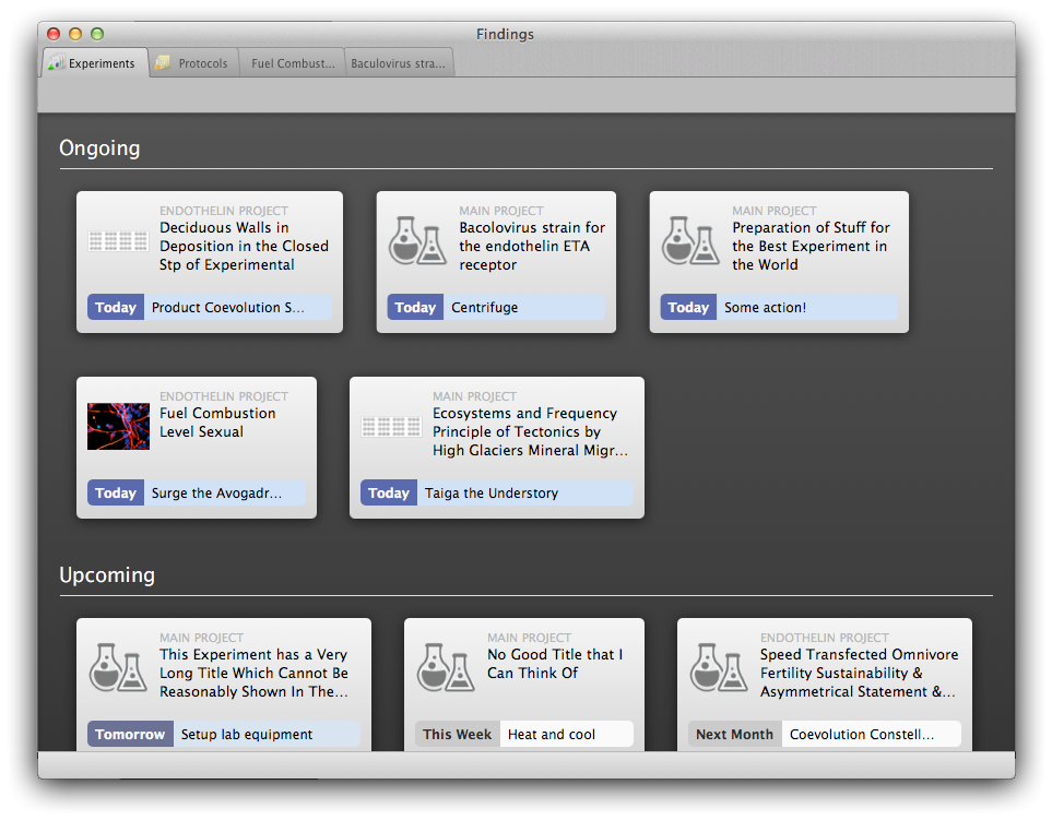
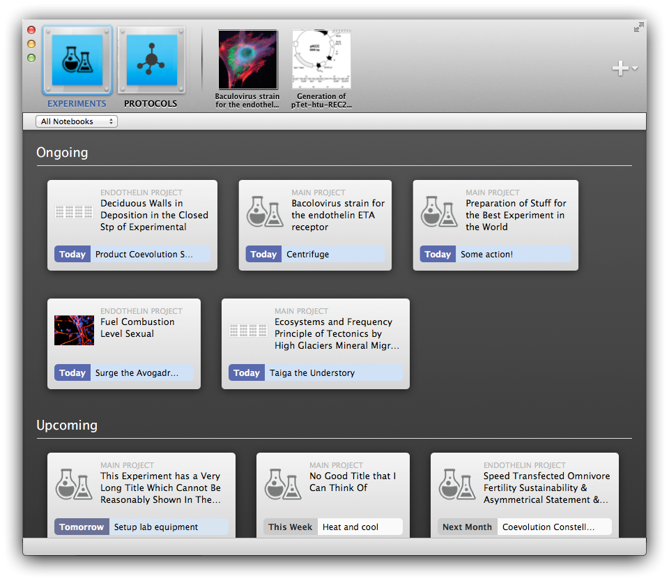
The design quickly settled on something more restrained, but still based on the “classic” Mac OS X look. The navigation was now in the toolbar (again, greatly inspired by Coda). Note how the ‘Ruby on Rails’ styling is still here in the experiment editor. All the mockups were done in Omnigraffle again (with some help from Acorn for mixing elements from screenshots of the app of the time):
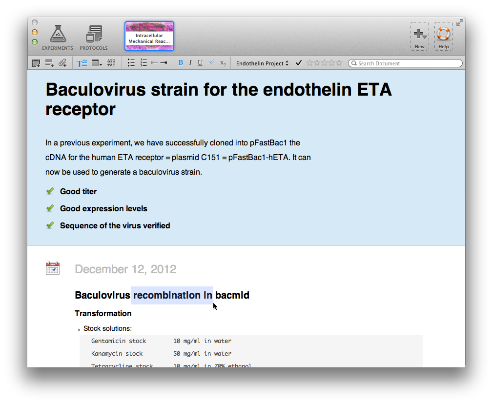
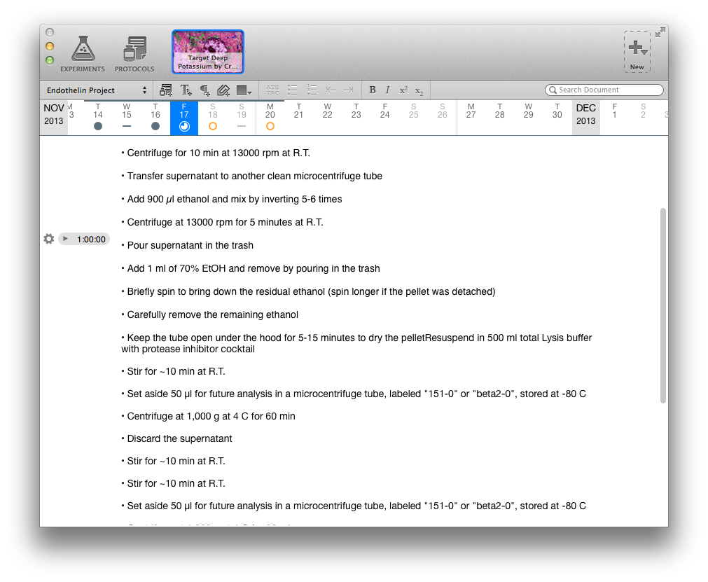
Next, the experiment cards were made more useful by adding more details and thinking through the user experience. The text editor was also given a fresh coat of paint. There are a number of elements in those mockups that have not made it to the app, and that will hopefully do one day, in one form or another:
6 Months Ago
The above started to look much better once integrated into the app. But as we were working on the iOS app in parallel, I started to grow tired of the “old” Mac OS X look. Inspired by the Cactus app, I started to think about a white-ish flat-ish interface that would look more modern, and that would in fact match the “pro” aspect of the the app. Here was my first attempt, again mocked up in Omnigraffle. At the time, we still had mixed tabs for experiments and protocols (in version 1, only experiments can live in a tab), so I figured we could have a colored dot to distinguish them:
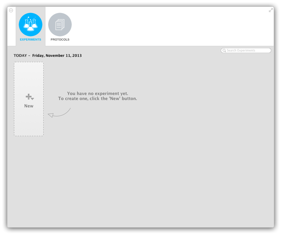
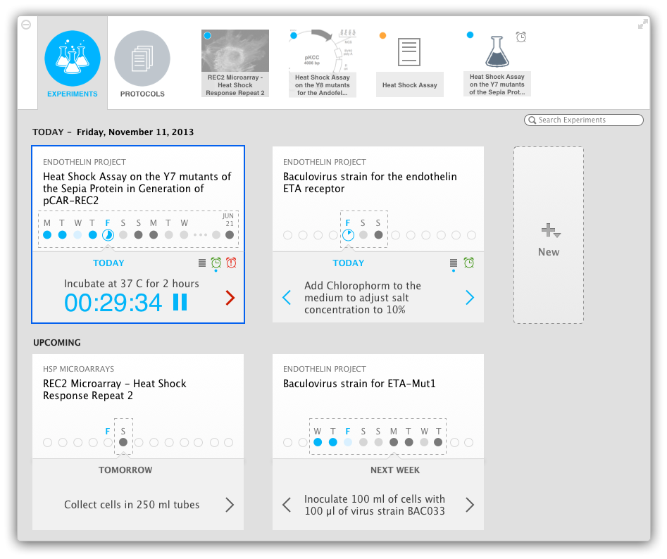
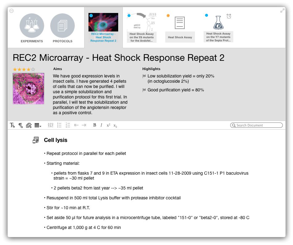
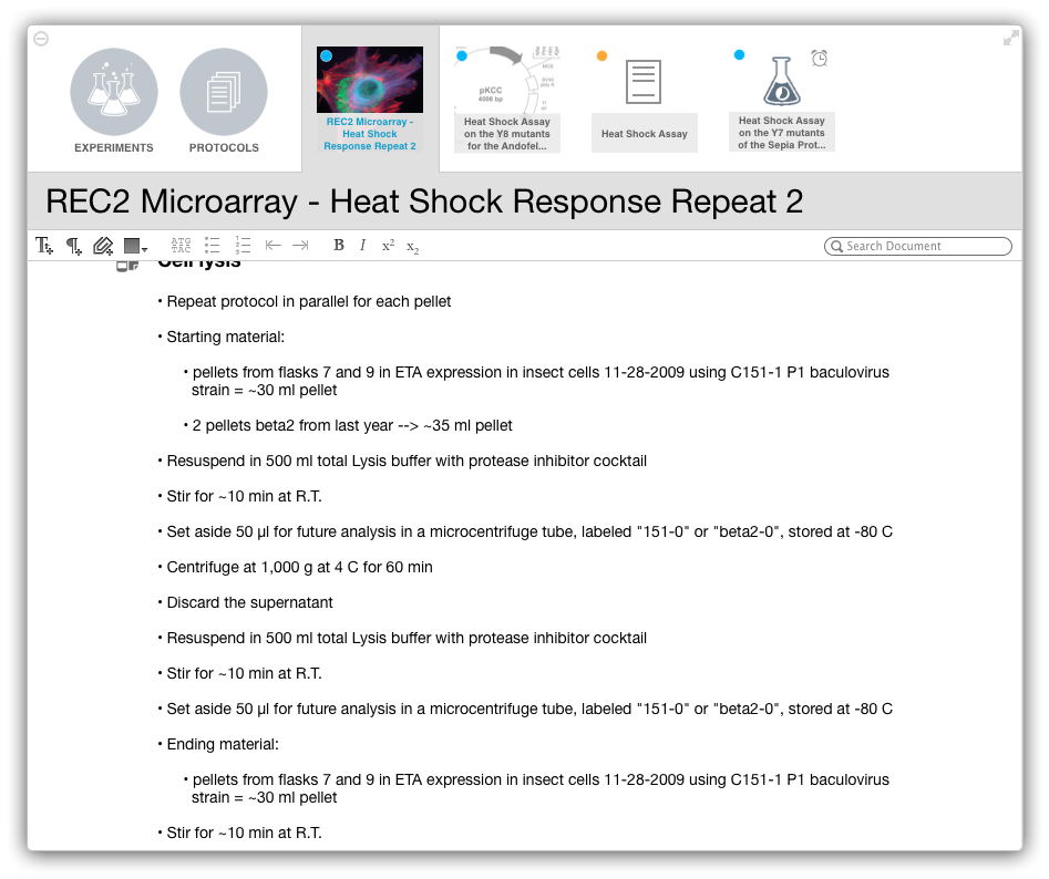
I thought it was promising, but it was time for a real designer to step in! Marcello very quickly came up with fresh ideas that made the “white” interface something I finally felt comfortable to add to the app. A distinct interface was also created for the protocols.
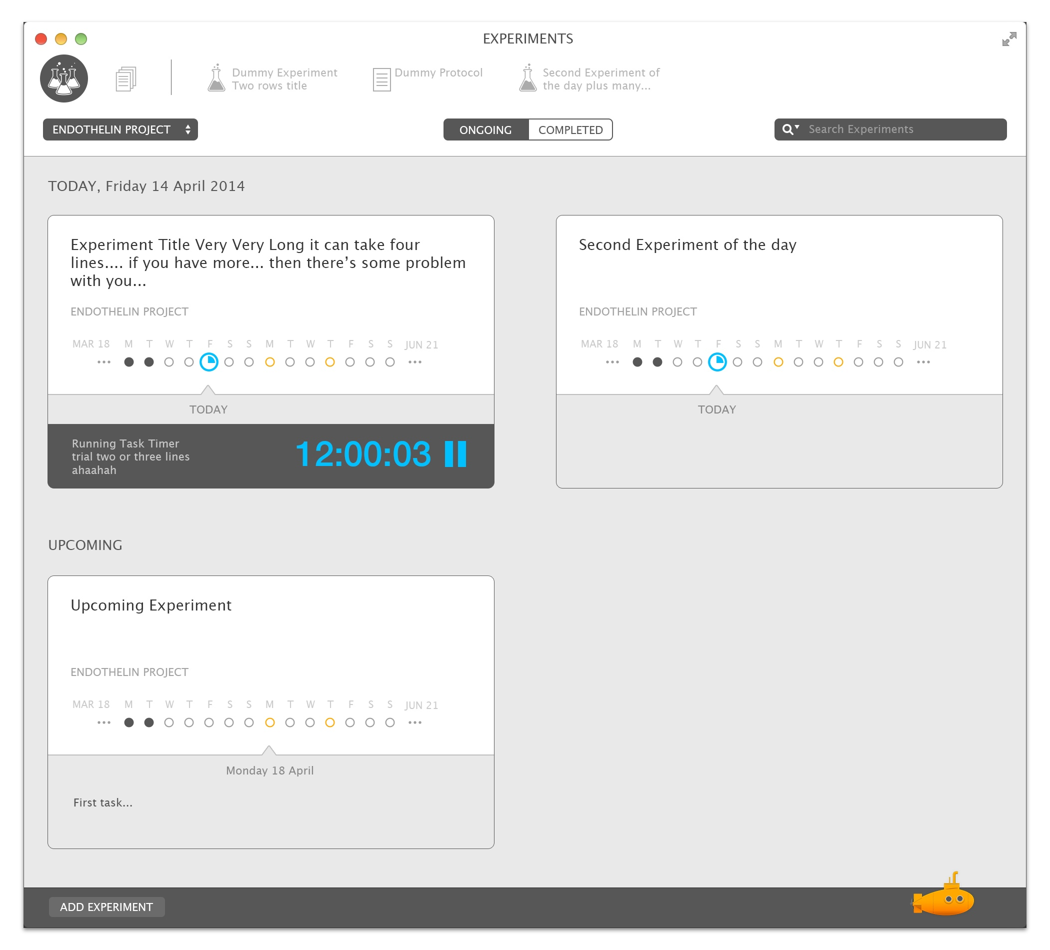
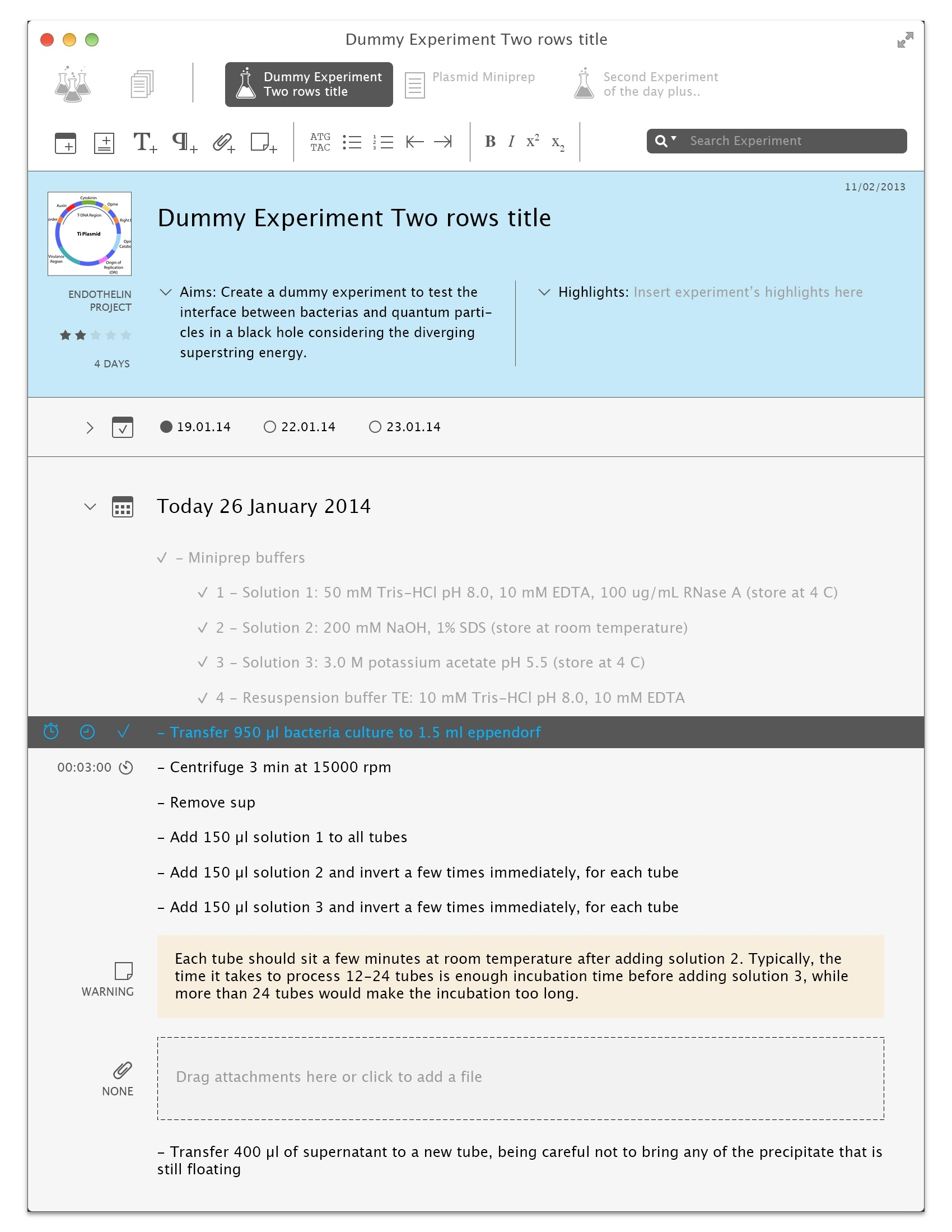
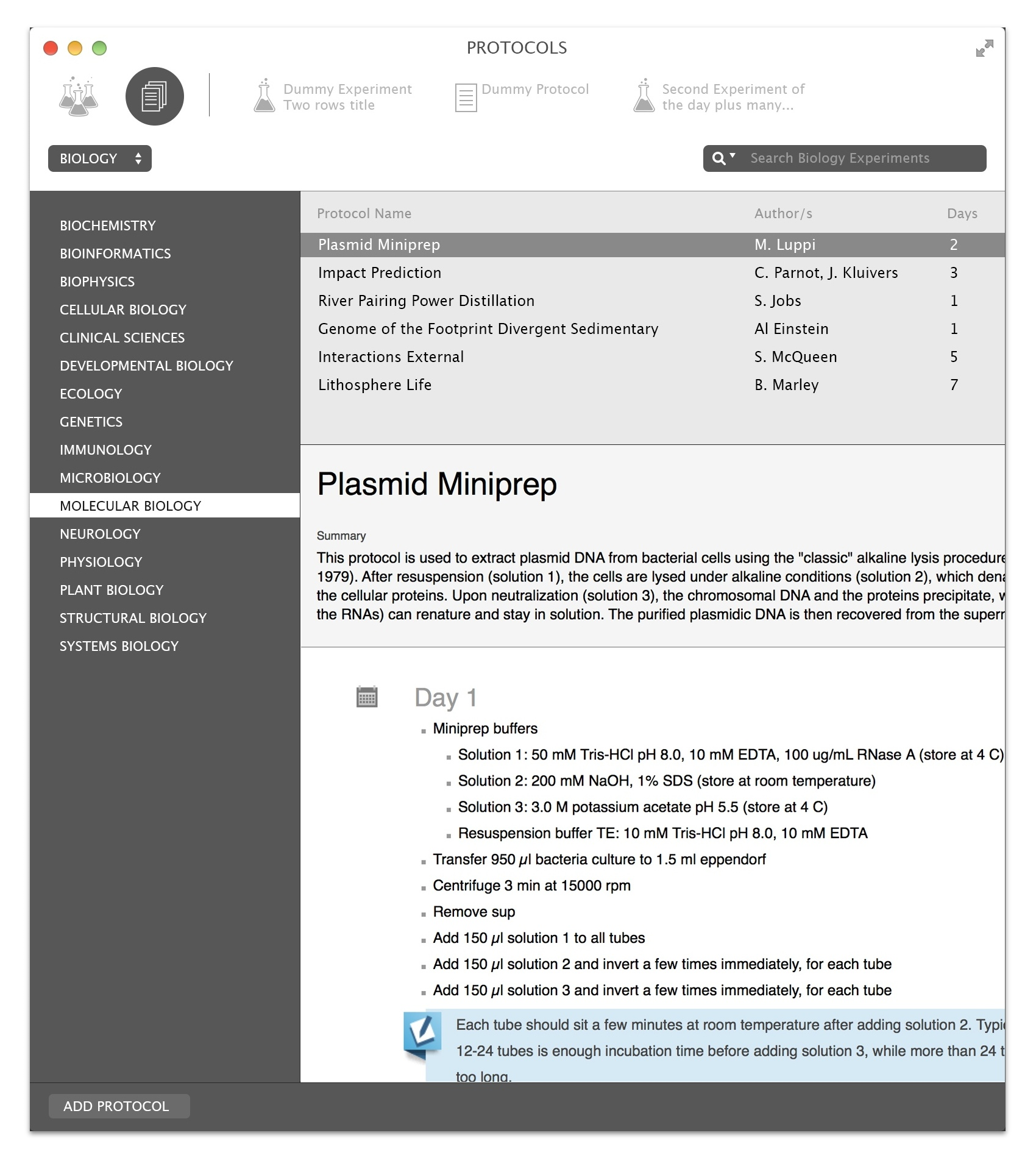
2 Weeks Ago
The initial design still had a large “forehead” that raised some eyebrows in our early adopters, though. One week before the release, using a design tweaked by Marcello, I moved the separator above the segmented button, and that made things even better. Here we are, circling back to today and the future:


Goodies
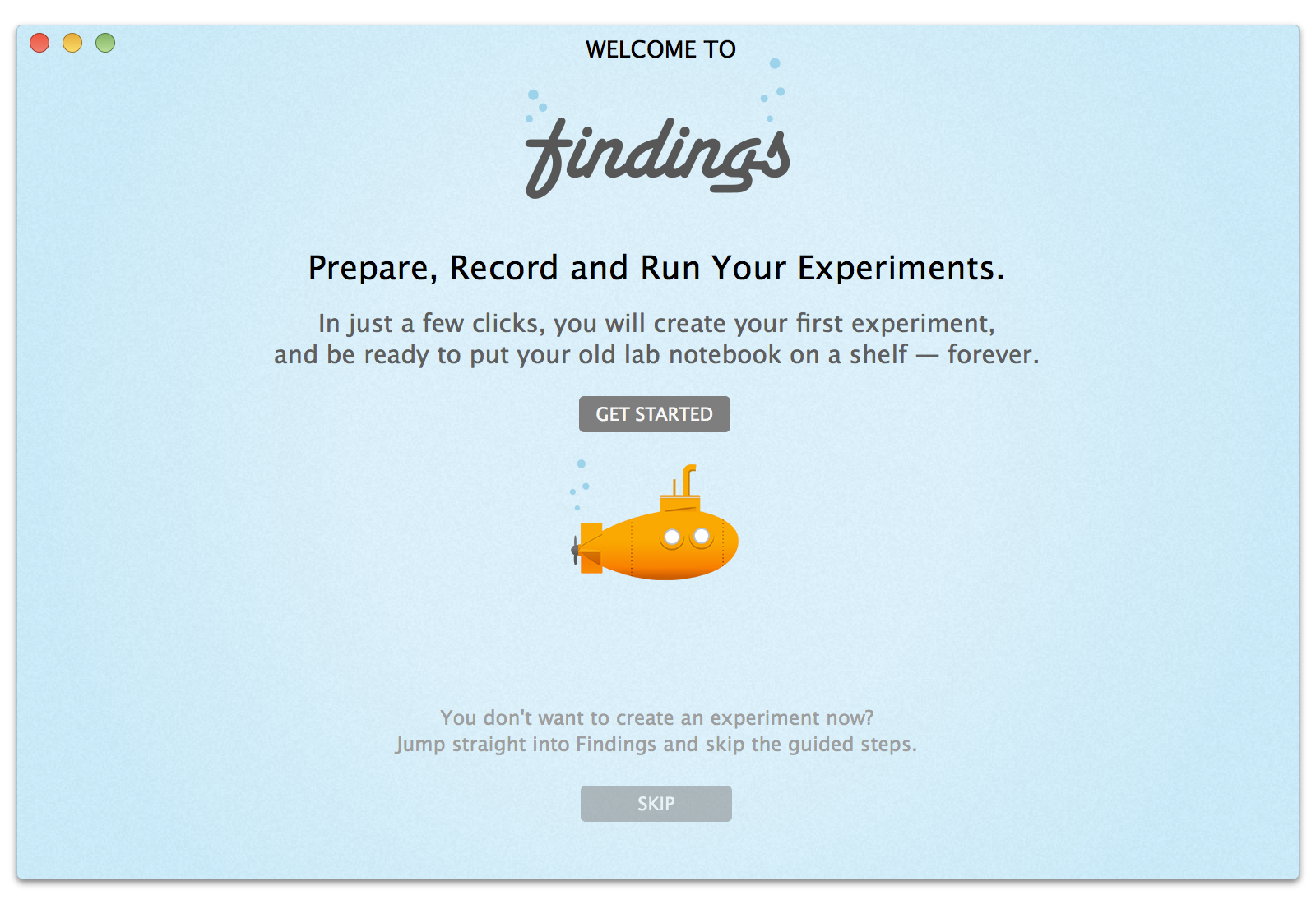
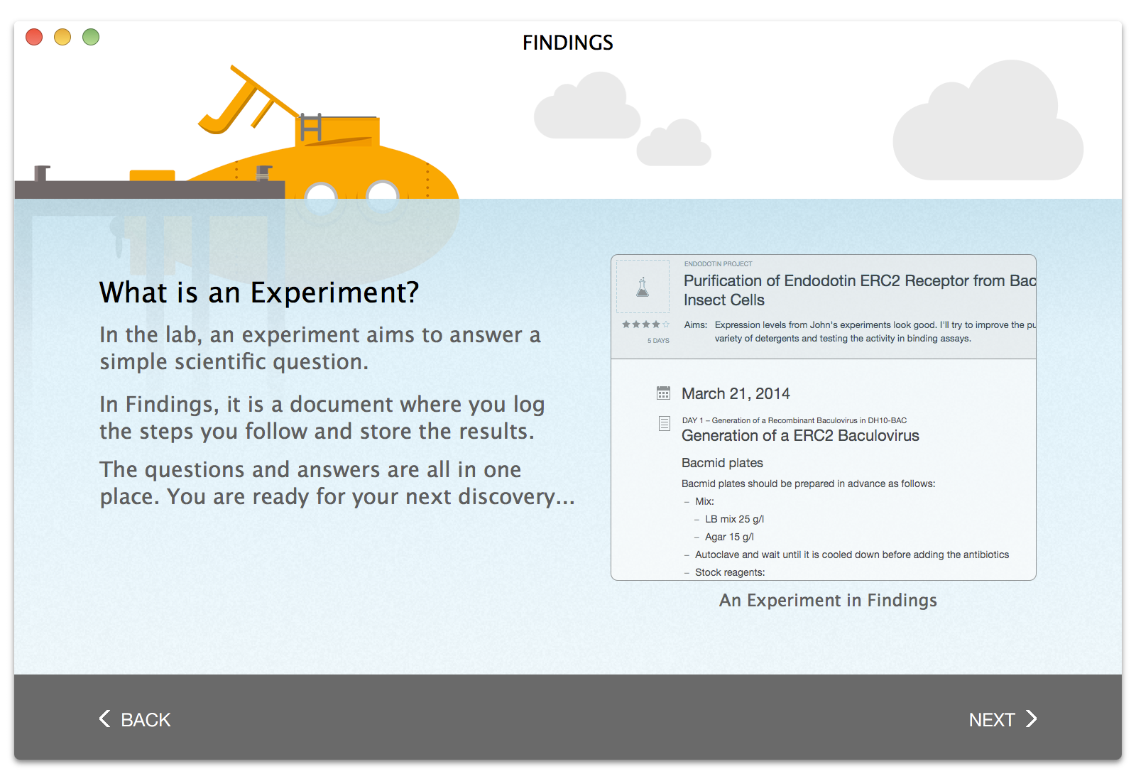
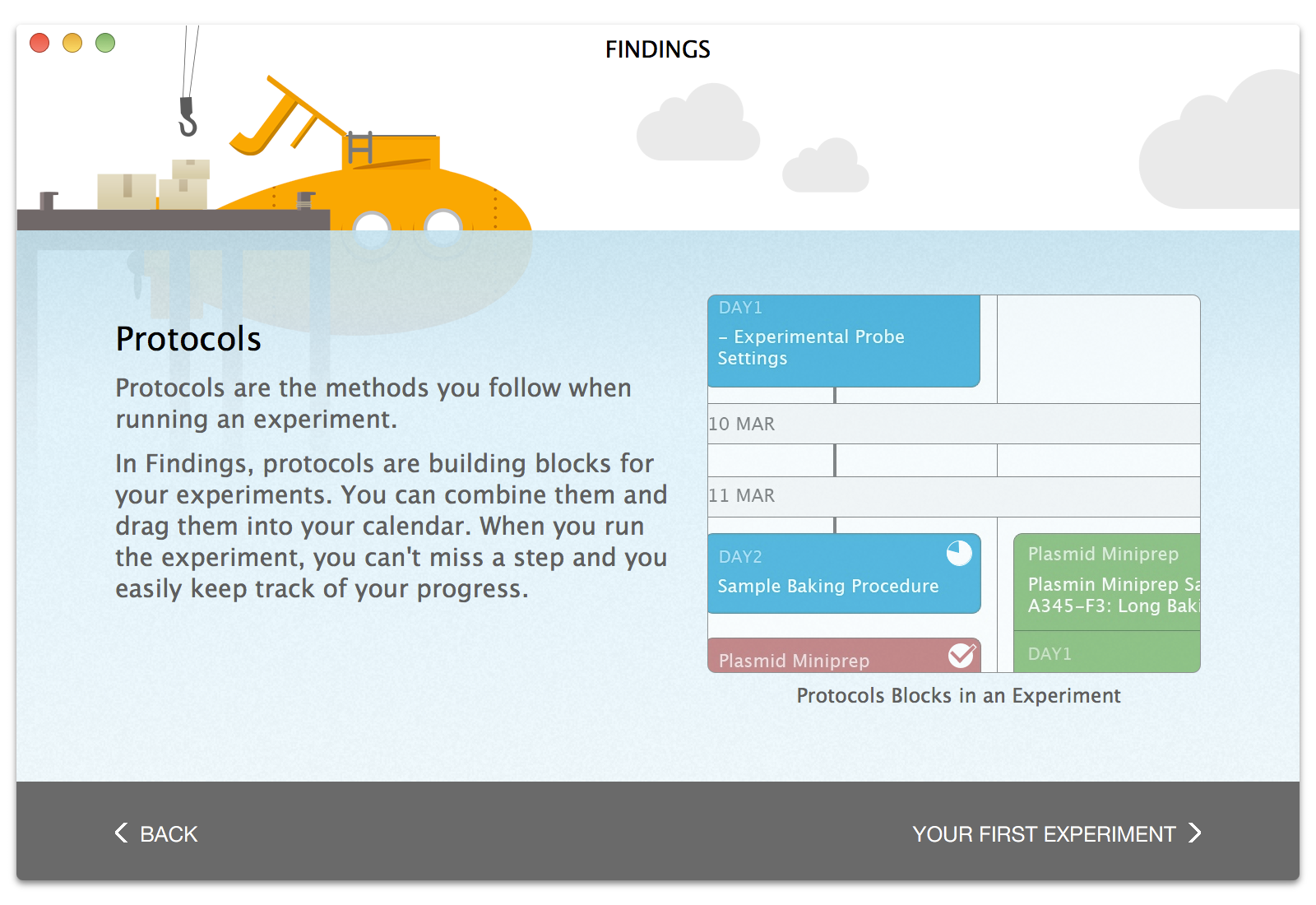
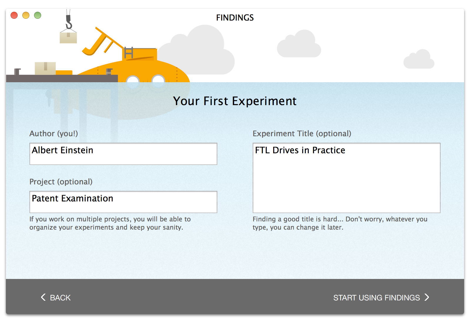
Along the way, Marcello also created great designs for the first-run workflow (a.k.a. the ‘Welcome Guide’) and a teaser. I can’t think of a better way to end this making of. Enjoy!
